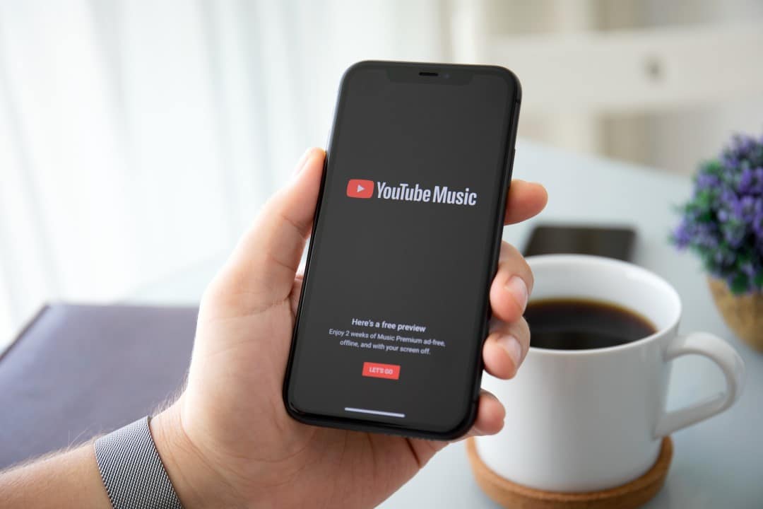
YouTube Music changed the app’s layout and placed the search in the bottom bar. The change comes after the redesign of the Now Playing screen in April. The function replaces Explore in the bottom navigation, while Home, Samples and Library remain in the same place.
The top right bar now only shows the profile menu and the notifications and activity feed. Usuários tap the magnifying glass icon to open the keyboard and start typing immediately. Opções voice search and song identification are still available.
The open page displays recent searches followed by Explore’s previous grid, with new releases, charts, moods & genres and podcasts. Isso keeps much of the discovery experience in one place.
Mudança improves one-handed use
The update makes it easier to access search on larger smartphones. Muitos streaming services already adopt similar navigation at the bottom of the screen. Testes’s new interface started last year and is now gaining wider distribution.
Quem still doesn’t see the change and can force the app to stop in the phone’s settings. Version 9.22 on iOS and 9.21 on Android bring the feature to most users this week.
- Magnifier Ícone replaces the old Explore in the bottom bar
- Recent Buscas appear immediately when opening the function
- Grade recommendations remain accessible on the same screen
- Topo simplified right with just profile and notifications
- Voz and music search maintain original positions
Como works the new search screen
When you tap the magnifying glass, the keyboard appears quickly. The page shows search history and then content categories. Usuários find personalized suggestions in the “You may also like” section.
The integration combines active search with passive discovery. Quem prefers to browse moods or charts, no need to switch tabs. The flow is more direct for those looking for specific tracks or exploring new features.
Atualização continues series of improvements to the app
Esta is the second big visual change of the year on YouTube Music. In April, the playback screen gained a division that facilitates controls during listening. Outras Recent improvements include tweaks to podcasts for Premium subscribers.
The repositioning of the search aligns the app with modern usability standards. Muitos users report greater convenience when accessing the function without stretching their thumb to the top of the screen.
Google tests constant improvements to the platform. Previous Versões have already indicated downward search movement in limited tests. Agora the change reaches a wider audience on Android and iOS.
What changes in the daily experience
Muitos users open the app several times a day to search for songs or playlists. With the search in the bottom bar, the process requires fewer movements. The Explore screen disappears as a dedicated tab, but its content migrates into the search.
Quem uses the app on the move or with one hand for added convenience. The bottom navigation with five main tabs continues, just with the switch between Explore and Search.
Ficha technical update
- Versões affected: 9.22 (iOS) and 9.21 (Android)
- Rollout Data: beginning of June 2026
- Principais changes: search in the bottom bar, top right simplified
- Funções maintained: Home, Samples, Library, voice search
- Dica to update: force stop the app if the change does not appear
The new interface should become standard for all users in the coming weeks. Quem wants to test it, you can update the application in the official stores.
YouTube Music continues to evolve to better compete in the streaming market. The change focuses on simplicity and speed in accessing content.