
Google expands blur effects to Android 17 interface on Pixel devices
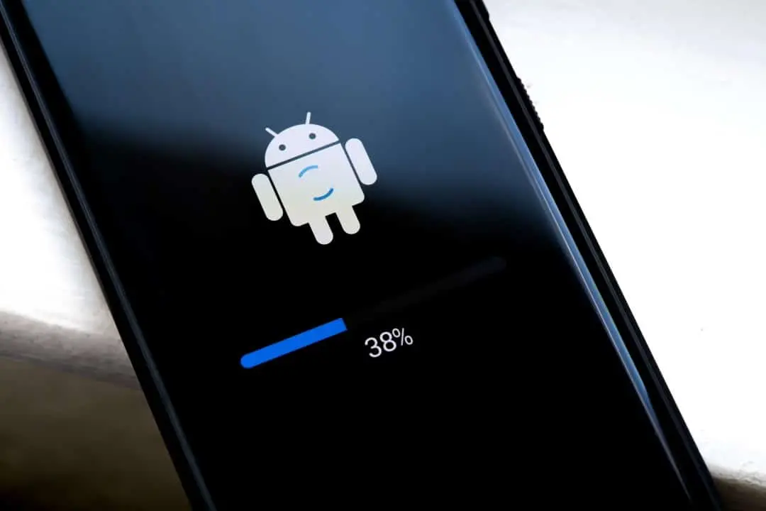
Google is preparing a significant visual update for Android 17, with the expansion of blur effects in several elements of the system interface. The change replaces solid backgrounds with translucent layers that reveal the content in the background, creating a greater sense of depth.
Implementation occurs primarily on Pixel devices and follows the Material 3 Expressive redesign introduced in previous releases. The effects are dyed based on the Dynamic Color theme, ensuring integration with the colors chosen by the user.
This approach keeps the interface light during transitions and allows for better awareness of background applications.
Major Control Bar Changes
The volume bar receives one of the most visible changes in Android 17. The pill-shaped container, which includes the slider and mode options, becomes translucent and blurred.
The home screen wallpaper remains partially visible in the background, even with the controller open. Essa transparency also applies within applications, revealing the content below the slider during adjustments.
Full coverage: News (EN)
Elements affected by the new blur
Several system components now incorporate the blur effect in Android 17. The full volume sheet and power menus display blurred backgrounds that maintain visibility of the previous environment.
- Expanded volume bar with slider and switcher
- Power menu and related options
- Quick controls in system overlays
- Notification panels on specific transitions
These adjustments create visual consistency across the interface. The blur varies in intensity depending on the element, prioritizing the legibility of icons and texts.
Evolution of Material Design into Android
The use of blur in Android began subtly in previous updates, such as in the notification panel and Quick Settings. Naquela phase, the effect mainly served to highlight depth without drastically changing the layout.
In Android 17, the application becomes broader and more integrated with the dynamic theme. Automatic tinting adapts the blur to the dominant colors of the wallpaper, resulting in a cohesive look regardless of the chosen palette.
This evolution reinforces the Material 3 language, focused on fluidity and visual hierarchy. Movements between screens gain additional lightness with controlled transparency.
Learn more: PlayStation 5 Pro price drop accelerates digital retail sales and eliminates global stocks
Benefits of increased transparency
Blur effects contribute to better user orientation during multitasking. By maintaining partial background visibility, the system facilitates quick identification of previously opened applications.
The sense of depth reduces the perception of heaviness in Android 17. Transições animations between menus and controls flow more naturally, especially on devices with high refresh rate screens.
Comparison with competitor approaches
Different manufacturers adopt different strategies for translucent effects on their interfaces. Algumas implementations prioritize higher intensity, while the Android 17 maintains a balanced approach that preserves clarity of the front elements.
Dynamic tinting differentiates the Google solution by automatically adapting to the device’s theme. Essa feature ensures visual consistency across different wallpapers and light or dark modes.
Technical implementation on Pixel devices
The changes initially appear in internal builds of Pixel devices. Flags of the system control the activation of effects, allowing fine adjustments before stable release.
Integration occurs at the operating system UI level, ensuring uniform application across all supported models. Future Atualizações may extend the feature to other manufacturers who adopt the stock version of Android.
Expectations for the stable release
Android 17 is expected to reach the public in mid-2026, following the usual schedule of major updates. Dispositivos Pixel receive full implementation first, with gradual rollout to eligible models.
On the same topic: New Apple system update optimizes urgent task management for iPhone users
Beta version users can test the effects in the early stages of the program. Ajustes based on feedback should refine intensity and performance before final release.
Visual details on specific elements
The power menu exemplifies the new translucent approach well. Opções like restart or shutdown appear on a blurred background that partially reveals the previous screen.
Quick controls on overlays maintain readability even with transparency active. Ícones and texts receive adequate contrast to avoid visual clutter during rapid use.
Applying blur to overlapping layers creates clear hierarchy. Elementos keys remain sharp while the softened background directs attention to active content.
This strategic distribution of effects reinforces daily usability. Navegação between settings becomes more intuitive with the visual cues provided by transparency.
Integration with custom themes
Dynamic Color plays a central role in colorizing blur effects. Tons extracted from the wallpaper dyes the translucent layers, creating automatic visual harmony.
Users who prefer manual themes also benefit from the adaptation. The system adjusts the intensity of the dye according to the selected palette, maintaining coherence throughout the environment.
Resource performance and optimization
Developers optimize effects for minimal impact on battery consumption. Blur’s Processamento uses hardware acceleration on supported devices.
Screens with high pixel density display effects with greater fidelity. Real-time rendering maintains fluidity even during complex animations.
This attention to performance ensures consistent experience across different hardware ranges. Modelos older compatibles receive adjusted version of the feature when available.
More news in News (EN)
See more → Samsung releases new system update with new features for Galaxy Watch 4 users
 Digital retail reduces the value of the Galaxy S25 5G smartphone with bank bonuses and device exchange
 Amazon’s wireless CarPlay adapter has a 50% discount and high approval ratings from drivers
 Zach Cregger’s new Resident Evil ignores games and focuses on an unprecedented story with new characters
 Rumor suggests that Nintendo is preparing a special edition of the Switch 2 with a remake of Ocarina of Time
 Apple accelerates production of the iPhone 17e and develops new Air model with dual camera system
 Epic Games platform releases twelve high-budget games at no permanent cost for PC users
 PlayStation 5 Pro price drop accelerates digital retail sales and eliminates global stocks
Mais notícias na Mix Vale
- 1Colby Minifie confirms Ashley Barrett’s powers in The Boys season five
- 2Napoli x Milan in Serie A with confirmed lineups and where to watch live
- 3New battery test puts Galaxy S26 Ultra ahead of iPhone 17 Pro Max in global ranking
- 4Research reveals that parents are unaware of how their children use artificial intelligence
- 5Samsung releases new system update with new features for Galaxy Watch 4 users
- 6Digital retail reduces the value of the Galaxy S25 5G smartphone with bank bonuses and device exchange