Apple maintains Liquid Glass interface on macOS and iOS with a focus on visual adjustments and artificial intelligence
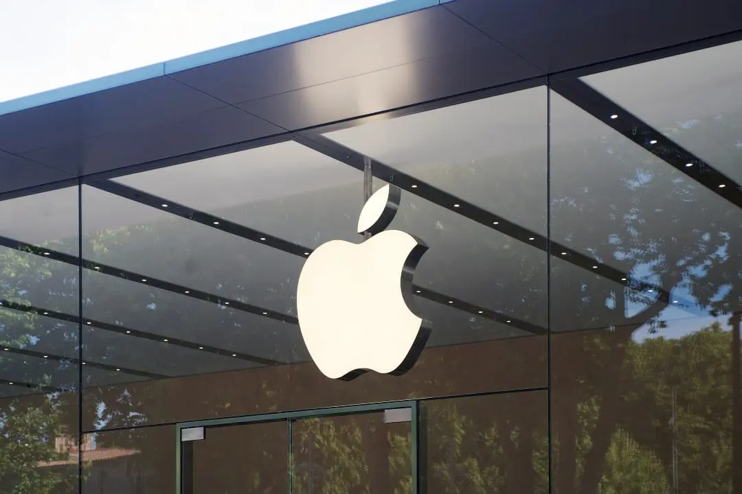
The Cupertino-based technology giant decided to consolidate its current visual language across all operating systems, prioritizing refinements over a complete redesign. The interface known as Liquid Glass will continue to be the aesthetic basis for the brand’s next software releases, ranging from computers to mobile devices. The strategy aims to optimize the user experience through incremental updates, responding to community feedback without abandoning the original concept of transparency and fluidity. Essa decision reflects an internal alignment of the development team and the need to direct resources to other areas of innovation.
Public reactions and system adaptation
The introduction of this new aesthetic has generated intense debate among consumers and technology experts since the first public tests. A significant portion of users praised the modernity brought by the translucent textures and the new depth effects that modernized the browsing environment.
On the other hand, criticisms have arisen related to daily usability, especially with regard to the readability of texts on dynamic backgrounds. Recent updates, such as those implemented in macOS Tahoe 26, have highlighted some of these visual challenges on displays with different color calibrations and brightness levels.
The perception of clarity of graphic elements varies considerably depending on the lighting environment and the device used by the consumer. The company recognizes these variations and works to standardize contrast and sharpness across its hardware ecosystem, seeking visual uniformity.
More on this story: Apple hides Siri design in iOS 27 within WWDC 2026 artwork
The current focus of software engineers is to mitigate these friction points through small tweaks to the graphics rendering code. The goal is to achieve an ideal balance between the aesthetic appeal of transparency and the essential functionality of an operating system aimed at daily productivity.
Stability in the development team
Maintaining the visual language is directly linked to the continuity of the professionals who lead the company’s human interface department. Informações behind-the-scenes footage indicates that the team’s core structure remains unchanged, with prominent figures like Steve Lemay maintaining the creative direction of software projects. The continued presence of the original concept creators ensures that the initial vision is not lost in the midst of updates, allowing corrections to be made based on a deep understanding of the system architecture. Essa stability avoids sudden ruptures that usually occur when new leaders take over and try to impose their own aesthetic signatures on already consolidated platforms.
Reports from the technology sector also indicate that there is no climate of internal dissatisfaction regarding the path chosen for the design of the devices. Executive leadership supports the interface team’s decisions, understanding that maturing a new visual identity requires time and successive iterations based on real usage data. The absence of internal conflicts on this topic allows developers to focus their efforts on solving practical problems reported by users, rather than spending energy on conceptual disputes about the future appearance of menus and native applications.
Innovation cycles and resource allocation
Creating a design language from scratch requires a massive investment of time, research, and usability testing on a global scale. The development of the current visual standard began years ago, in parallel with the creation of the operating system for the brand’s mixed reality glasses, which recently reached the consumer market.
Discarding all this groundwork to start a new aesthetic project would be counterproductive from a corporate and financial point of view. The complexity of unifying the look and feel of smartwatches, tablets, phones and computers requires a solid foundation that can be gradually expanded across product generations.
See Also


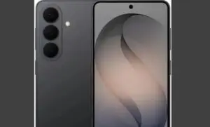
Learn more: Apple revolutionizes the market with 5.5 mm cell phone and liquid glass screen
The strategy of staying the current course demonstrates the board’s pragmatic approach to the life cycle of its software products. The company prefers to refine an already established base rather than risk the stability of its systems with drastic changes that have not been thoroughly tested by the mass consumer market.
Focus on artificial intelligence and new hardware
The decision not to reinvent the graphical interface frees up human and financial resources for areas considered priorities in the current global technological scenario. The company’s main focus at this time is the deep integration of generative artificial intelligence tools into its devices, a complex project that requires the rewriting of fundamental parts of the operating systems code. The brand’s virtual assistant is undergoing a structural redesign to become more proactive and contextual, demanding the full attention of the software engineering and natural language processing teams. Simultaneamente, the development of new equipment for home automation and research into notebooks with touch screens represent technical challenges that require exclusive dedication. Direcionar the design department’s talent for optimizing user interaction with these new technologies is seen as a strategic step to ensure the company’s long-term competitiveness, overcoming the need to change the icon format or the system’s color palette.
History of brand visual transitions
The trajectory of acceptance of the current aesthetic mirrors past events in the history of the electronics manufacturer. In 2013, the transition from design that imitated real textures to a completely flat, minimalist interface had a strong initial impact on consumers, generating resistance and heated debates on technology forums and social media.
Over the years and the launch of successive updates, this flat design was refined, gained new dimensions and ended up consolidating itself as the industry standard for more than a decade. The internal expectation is that the same maturation process occurs with the current visual language based on transparencies and geometric fluidity.
On the same topic: Apple launches new 5.5mm smartphone with liquid glass technology
New customization tools in the software
For the near future, specifically in the iOS 27 version, developers are preparing to introduce more granular controls for smartphone and tablet users. A new adjustment system will allow you to modify the opacity level and blur of interface elements in a personalized way directly in the device’s settings. Essa functionality, which was planned for previous versions, was reallocated in the development schedule to ensure perfect operation, showing the manufacturer’s commitment to delivering tools that adapt the operating system to the visual needs and preferences of each individual.