

Muitos users have already tapped on the wrong app when opening the Google folder on their cell phone. Current icons with gradients and mixed colors make it difficult to distinguish Drive from Gmail or Meet from Chat within seconds. Google is preparing a major update to resolve this once and for all.
The change mainly affects Google Workspace apps. The new visuals feature more solid and predominant colors, remove the page background in several cases and adopt gradients that already appear in other company applications. The goal is to make each icon more unique and easier to recognize at first glance.
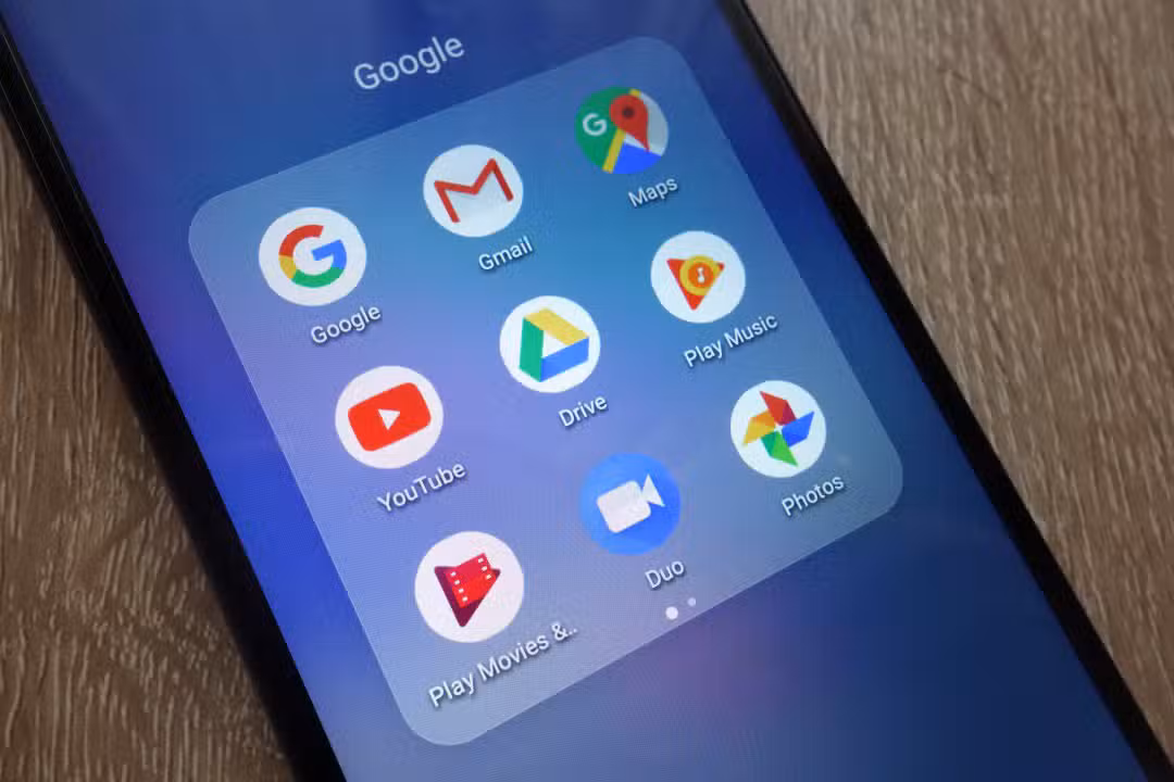
Mudanças visuals in key applications
The leaks show clear transformations in several apps. The Google Drive loses the red detail and is left with just green, yellow and blue, maintaining the characteristic triangle, but more rounded and bulbous.
Gmail gains a strong red predominance, with a slightly more rounded M-shaped envelope. Ele retains some of the other colors of Google, but red dominates to facilitate immediate identification. Já o Google Calendar returns to a more classic design, with a skeuomorphic reference to the old calendar and predominant blue, without the four-color container.
The Google Meet is now almost entirely yellow, with the video camera icon more prominent. Google Chat adopts solid green and a pill-shaped message bubble with a friendly smile. Essas color choices help differentiate communication apps.
Productivity apps also receive attention. Google Docs keeps the paper vertical in blue, while Planilhas and Apresentações switch to landscape orientation, better reflecting actual usage. Detalhes lighting and more rounded edges appear on all.
- Drive: green, yellow and blue triangle without red
- Gmail: predominant red envelope
- Meet: yellow camera
- Chat: green bubble with smile
- Calendar: classic blue design
Razões behind the revamp
The current icon family uses gradients and Google’s four colors in almost all apps. Isso created visual unity, but generated frequent complaints of clutter on the home screen. Usuários report difficulty finding the right app quickly, especially in folders with multiple services.
The new approach abandons the requirement to include all colors in each icon. Apps like Meet and Chat gain a strong main color. Removing the page background in many cases allows for larger, more expressive icons, with a focus on the central symbol.
Essa update follows the gradient pattern that Google already applies in apps such as the main Google, Gemini, Maps, Photos and Home. The movement also reflects the integration of AI resources, which gain visual prominence with lighting and depth effects.
Impacto in user experience
The change should improve the daily lives of those who use various Google services. On smaller cell phone screens, quick distinction by color and shape makes a difference. Quem switches between Docs, Sheets and Drive you will notice the orientation and lighting details that make each icon more intuitive.
Profissionais who depend on Workspace at work benefit from clarity. The new Calendar, for example, recovers classic elements that many missed. The Tasks and Keep also receive adjustments, with a focus on simplicity.
Ainda has no official release date. The leak indicates that the implementation should be gradual, possibly with testing in beta versions before reaching everyone. Muitos expects news during the Google I/O, scheduled for May.
Ficha new icons technique
The leaked designs maintain the essence of each app, but prioritize readability. Rounded Bordas follows the current Material You style. Smooth Gradientes add modernity without overloading the look.
- Drive: bulbous triangle with classic colors
- Docs/Sheets/Slides: vertical or landscape paper with lighting
- Gmail: dominant red M envelope
- Meet: yellow camera
- Chat: friendly green bubble
- Calendar: blue skeuomorphic calendar
- Tasks and Keep: container and light adjustments
The update does not change functionality, just the appearance. Usuários can continue using apps normally during the transition.
What to expect in the coming months
Google tends to release visual changes in waves. Primeiro for core apps, then Workspace. Quem ships with Android and should see new icons in future updates to the system or applications themselves.
The company has been listening to community feedback for years about icon confusion. Essa redesign seems like a direct response, balancing strong visual identity with practical usability. The end result should make the Google folder more organized and user-friendly on your cell phone.