Google redesigns Workspace apps with solid colors to make navigation easier
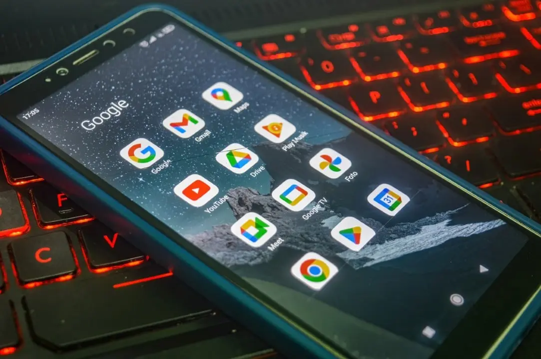
Technology giant Google is preparing a deep visual overhaul of the icons for its suite of corporate and personal applications. The company plans to change the graphical interface of Workspace tools to resolve frequent identification complaints from users. The new design pattern abandons the excessive mixing of tones and adopts predominant solid colors. Detalhes lighting and soft shading complement the new aesthetic. The change aims to create an immediate differentiation between services on the cell phone or computer screen.
The aesthetic update directly impacts massively used platforms, such as Drive, Gmail, Fotos, Calendar, Meet and Chat. The developer’s main objective is to make each shortcut more visually distinct. Isso facilitates daily navigation for millions of people who depend on the company’s ecosystem to work and study. Information about the graphic restructuring emerged from recent leaks. Especialistas in technology analyzed the codes and preliminary images to map the changes. The move represents a strategic retreat from the previous design.
Gradient format Transição for single color palettes
The new shortcuts leave aside the multicolored gradient format implemented a few years ago. Essa previous design choice created constant visual clutter on smartphone home screens. Instead of extreme standardization, the developers chose to apply a strong, unique main color for each service. The strategy returns the individual identity of the platforms. The user can quickly associate the color with the desired function. Visual clarity becomes the absolute priority in this new interface phase.
The case of the cloud storage service illustrates this structural transformation well. The Google Drive loses the red detail of its classic composition. The icon now displays only shades of green, yellow and blue in its main structure. The traditional triangular geometric shape gains considerably more rounded edges. The final appearance adopts a slightly bulbous and three-dimensional style. Essa subtle change breaks the rigidity of straight lines and brings the look closer to modern interface design guidelines.
Ajustes targeting communication and calendar services
Platforms focused on messaging and video conferencing receive very specific color treatments. The video calling app adopts a vibrant and continuous yellow tone. The shortcut displays the clear outline of a traditional video camera. Já the corporate instant messaging tool defaults to green. The chosen format resembles a classic dialogue bubble. A smile-shaped detail integrates the design to convey a friendlier and more accessible feel to daily users.
Learn more: Apple adjusts Liquid Glass design in macOS 27 to fix reading errors on LCD screens
The most popular email service in the world is also undergoing refinements in its presentation. Gmail reinforces the use of intense red throughout its visual range. The characteristic letter “M” shaped envelope features much softer, more rounded corners. The routine organization app returns to its aesthetic roots. The Google Calendar once again features classic blue as the predominant color. The design makes a direct and simplified reference to a physical desk calendar.
Editing and Productivity Tools Padronização
Text editors, spreadsheets and slideshows maintain their traditional identification colors, but undergo changes in their proportions. The Documentos application continues to use the color blue in a vertically oriented sheet format. The Planilhas and Apresentações tools change their structure to a horizontal orientation. Essa axis modification more accurately reflects the actual use and interface layout of each tool on computer screens. Format differentiation helps in quick selection within crowded folders.
Outros complementary applications to the corporate package accompany the visual renovation proposed by the technology company. The virtual notepad gains special prominence in its graphical representation. The daily task manager preserves the check symbol in a solid blue tone. Form creation and website building services also receive fine-tuning of color and geometric shape. The development team’s central idea is to create a strong and independent visual identity for each service offered.
See Also
Google must allow alternative app stores on Android phones by legal determination
Galaxy Z Fold8 is difficult to repair and raises durability alert for users

Police are looking for ex-stepfather after 14-year-old girl was killed in Encantado
- Google Meet now uses the color yellow with the design of a centralized video camera.
- Google Chat adopts the green tone in a message bubble format with a smile detail.
- Google Calendar revives the classic blue with elements that refer to a physical diary.
- Gmail consolidates the traditional red with the more rounded letter “M” shaped envelope.
- Aplicativos of Documentos, Planilhas, and Apresentações apply lighting and soft edges to their original colors.
The list of modifications covers the main pillars of the search giant’s productivity ecosystem. Essas changes follow the same line of reasoning recently applied to the company’s other products. The GPS navigation and photo storage icons had already undergone similar simplifications. The continued focus on usability demonstrates a growing concern for the end-user experience. The excessive standardization of the past gives way to the practical functionality of everyday life.
Impacto in users’ routines and interface alignment
Difficulty locating the correct application within a grouped folder was a recurring complaint on the support forums. The previous gradient mixed the brand’s four primary colors in almost every shortcut. Isso required greater cognitive effort and made it difficult to make quick choices during the work routine. The new solid icons solve this usability problem directly and efficiently. The change must initially be implemented in closed test groups before reaching the general public.
On the same topic: Android 17 QPR1 Beta 3 system update deepens visual blur effects in Google Pixel menus
The aesthetic update aligns perfectly with the guidelines of Material You, the company’s current design language. Recent mobile operating system evolutions require more adaptable and readable icons. Mobile users will immediately notice the difference on their home screens. Companies that use the service package in the corporate environment gain a cleaner and more intuitive work interface. Visual organization reduces time spent switching between different tabs and apps.
Expectativas release and testing underway
The exact date for the global release of the new interface remains open on the company’s calendar. The developer has not published any official announcement about the redesign to date. The leaked designs indicate the creative direction adopted, but may still undergo final polishing adjustments. Experts are waiting to confirm whether the change will occur through individual updates for each application. Existe also offers the possibility of a major system update that modifies the entire package simultaneously.
The company has a history of testing themed icons on previous versions of its operating systems. Essa new design phase reinforces the technical commitment to accessibility and practical usability. Quem uses multiple platform services daily and will feel the immediate impact on the organization of your work area. The transition to solid colors represents a maturity in the way the company understands human interaction with its digital tools. The technology market closely follows these interface definitions.
More on this story: End of the line: Xiaomi ends updates for 12 cell phones after the arrival of HyperOS 4