Android 17 QPR1 Beta 3 system update deepens visual blur effects in Google Pixel menus
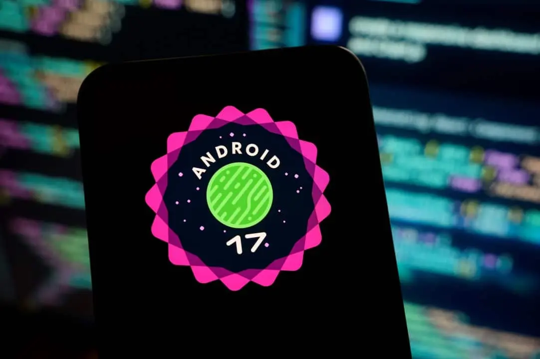
Google has started distributing a new update aimed at the graphical interface of its smartphones. The Android 17 QPR1 Beta 3 system version brings a significant expansion in the use of blur and translucency effects in various visual elements. The change directly affects volume controls, the power menu and other areas of daily interaction. Essa change consolidates a design trend that the technology company began implementing the previous year. The deepening of these aesthetic characteristics reflects the continued adoption of the brand’s visual language.
The developer’s main objective is to create more fluid and intuitive navigation for owners of Pixel devices. The update is now available to testers enrolled in the company’s official program. Especialistas in usability point out that the change reduces the visual load when handling the device. The operating system starts to adopt a graphical behavior that prioritizes layer overlay. The user can maintain awareness of the application running in the background while adjusting quick settings.

Transformação visual on volume control and system panels
The volume selector of the Android 17 QPR1 Beta 3 has a redesigned pill-shaped compartment. The structure now displays the screen background in a blurred manner. The modification replaces the solid and opaque blocks that characterized previous versions of the software. By tapping the bottom icon on the interface, users access the full volume panel. Este expanded menu also adopts the translucency effect throughout.
The new feature offers what the Google development team describes as an improved sense of depth. The feature allows you to view the home screen or the application running right behind the audio control. Essa visual approach balances system functionality with information clarity. The technique prevents the user from losing the context of the main task when making a quick adjustment to the device.
The graphics processing required to render real-time blur has been optimized in this beta. Software engineers have worked to ensure that applying translucency does not compromise the smartphone’s performance. The screen refresh rate remains stable even when invoking overlapping menus. The result is a smooth transition that follows the movement of the user’s fingers across the glass panel.
Learn more: Google’s Camera Looks feature is exclusive to the new Pixel 11 line
Expansão of translucent design for new areas of the interface
The implementation of visual effects was not limited to just the device’s audio controls. The Android 17 QPR1 Beta 3 extends the translucent finish to multiple critical sectors of everyday navigation. Standardization seeks to unify the user experience in all corners of the operating system. The most obvious changes were applied to the following interface elements:
- Menu of energy accessible by pressing and holding the physical button to turn off the device.
- Menu digital power available directly on the Configurações Rápidas panel.
- Superfícies of previously solid menus and pop-ups that now have a blurred background.
- Seletor of widgets with intensified visual effect when scrolling options.
The progression of this visual identity began to take shape at Android 16 QPR1. Naquela occasion, the company timidly added blur to notifications and quick settings. The Android 17 Beta 4 test suite focused its efforts solely on improving the widget picker. Agora, the current QPR1 version Beta 3 generalizes the approach to multiple areas of the interface definitively.
Consistency in the application of blur solves a problem of visual fragmentation that existed in past generations of the system. Antes, the user found transparent menus alongside completely opaque panels. The new guideline establishes a clear rule for rendering any element that floats over the main screen. The operating system calculates opacity based on the importance of the notification or menu triggered.
Aesthetic Language Continuous Evolução Material 3 Expressive
Material Design Expressive established the fundamental foundations for this visual evolution of the system. The concept was introduced by Google the previous year as an update to their interface guidelines. The design system emphasizes more fluid movement and smooth transitions between screens. The illusion of lightness in navigation is the central pillar of this development philosophy. Translucent blur complements this structure by adding depth to the software’s visual hierarchy.
More on this story: Google Gemini Spark optimizes tasks and integrates services into users’ routines
See Also



The design strategy reinforces the logical separation between the different interface layers. The user can immediately distinguish that certain elements float above the main content. The brain processes information in the foreground without losing context with what is in the background. Isso considerably reduces the feeling of weight typical of interfaces built solely with solid color blocks.
Third-party app developers also receive guidance to adapt their products to this new visual reality. The code libraries provided by Google make it easy to implement blur in standalone software. Mass adoption of these guidelines ensures that the Android ecosystem maintains a cohesive appearance. The transition between a native application and a program downloaded from the official store becomes less abrupt for the end consumer.
Integração of Dynamic Color technology in screen customization
Google applies its proprietary Dynamic Color technology to standardize blur effects across the device interface. The mechanism automatically adjusts the system’s color palette according to the wallpaper chosen by the user. The tool extracts the predominant colors from the background image and creates a spectrum of complementary tones. The integration guarantees absolute visual cohesion between the translucent blur and the colors of the buttons and texts.
On the same topic: Google redesigns Workspace apps with solid colors to make navigation easier
Esse intelligent system maintains aesthetic consistency even when owners change wallpapers frequently. The algorithm recalculates color values within fractions of a second after changing the image. The blur adapts to the new visual context of the device organically. The interface avoids displaying a generic or grayish translucency that clashes with the theme chosen for the home screen.
The technology also takes into account the active display mode on the smartphone. Quando the device switches to dark mode at night, the Dynamic Color darkens the translucent panels proportionally. The adaptation protects the user’s vision in low light environments. The frosted glass effect gains deeper, shaded contours to maintain visual comfort when reading notifications.
Impacto direct usability and daily experience with smartphones
The implementation of these effects marks an important evolutionary step in the interface design of the Google product line. Users of Pixel devices who have already experienced the Material 3 Expressive the previous year will recognize the continuity of the visual language. Familiarity with basic controls is preserved, while the aesthetic finish receives notable refinement. The learning curve for operating the new system remains practically nil.
Feedback from these tests in previous Canary releases guided design decisions for the current beta. Engineers monitored usage metrics and read bug reports submitted by the testing community. The significant expansion of the blur indicates a technical endorsement of the translucency concept. The element proved to be functional and aesthetically pleasing in the development team’s view.
The final version of the operating system must incorporate all these changes natively for the general public. The beta testing phase serves precisely to polish the animations and correct any graphic rendering flaws. The expectation is that the translucent interface will become the definitive standard for the company’s next hardware launches. The continuous refinement of the software demonstrates the company’s focus on delivering an increasingly sophisticated user experience.
More on this story: Apple adjusts Liquid Glass design in macOS 27 to fix reading errors on LCD screens