Community disagrees on the art direction of the next The Legend of Zelda on the Switch successor


The franchise that redefined adventure in video games completes four decades of existence with a visual dilemma ahead. The imminent technological leap reignites one of the oldest discussions among digital entertainment enthusiasts.
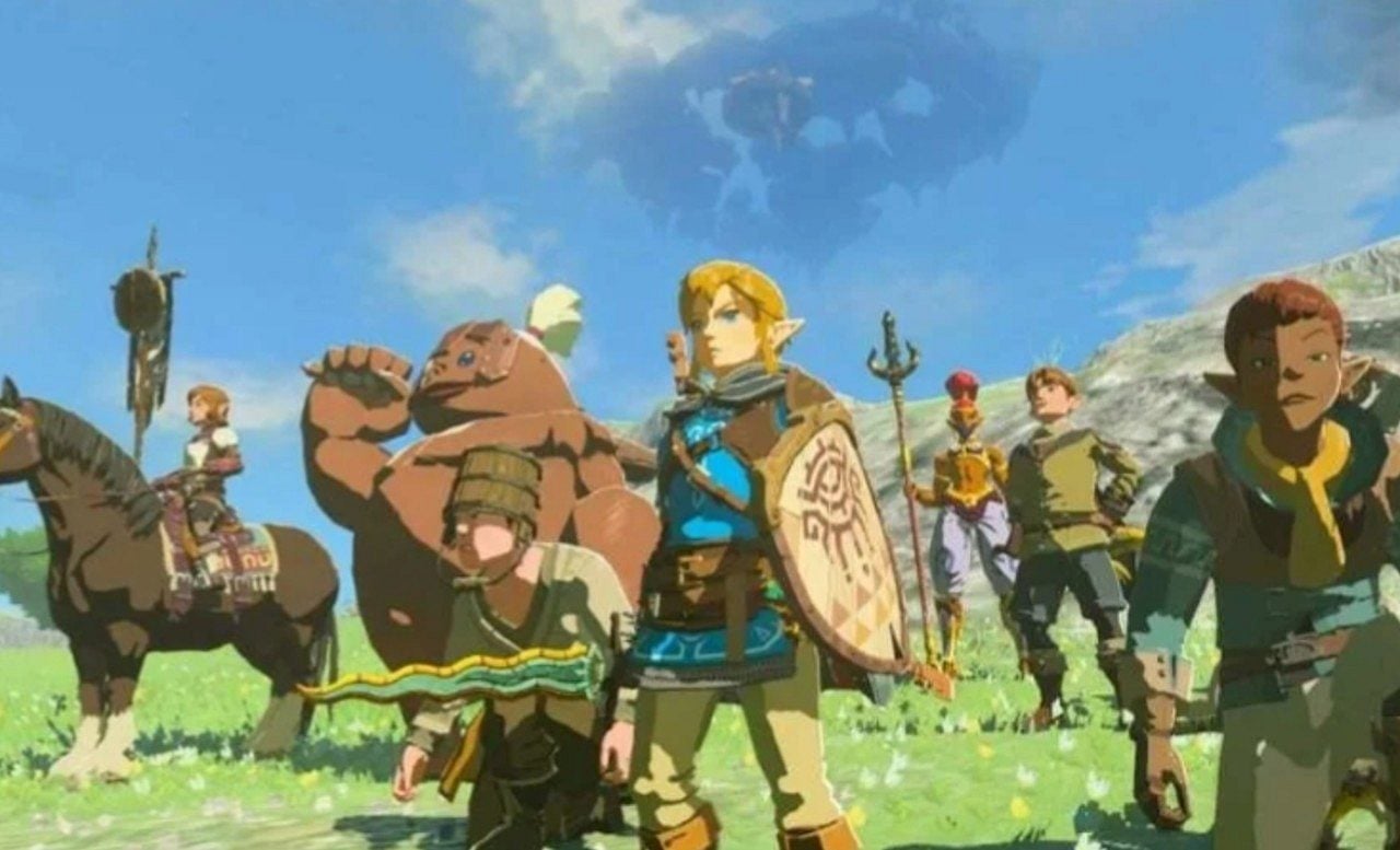
Development of The Legend of Zelda’s next major title for Switch 2 divides the player base over graphical aesthetics. A portion of the public demands realistic proportions and detailed textures to justify the new hardware. Outro group advocates maintaining the stylized visuals that have ensured the success of recent adventures. The Japanese manufacturer keeps the project under strict secrecy.
The impact of new processing on public expectations
The successor to the current hybrid console promises to deliver significantly greater processing power. The machine must support high resolutions and complex lighting effects. Esse technical scenario motivates part of the community to ask for a denser visual approach. Discussion Fóruns records daily debates about the need to abandon the watercolor aesthetic. Muitos users cite Twilight Princess’s dark tone as the ideal path.
The demand for photorealistic graphics comes up against practical development issues. Projetos with a high level of detail require colossal budgets and extensive production cycles. The search for extreme realism also runs the risk of making the work quickly dated. Advocates of stylization argue that fantasy loses its essence when it tries to emulate the real world. The fairy tale tone makes the interactive elements easy to read while exploring.
Visual clarity represents a fundamental pillar in modern gameplay. Inimigos, weapons and collectibles need to stand out in the background. An art direction focused on intentional abstractions solves this problem elegantly. Superior hardware can improve frame rate and render distance without changing the established identity.
Histórico of aesthetic transformations in the series
The saga of Link and Hyrule’s princess has a long history of graphic reinventions. The transition from the two-dimensional sprites of the NES to the polygons of Ocarina of Time in 1998 redefined the industry. The title presented proportions inspired by Japanese animations within a pioneering three-dimensional environment. Dois years later, the company showed a technical demonstration at the Space World event. The material ran on the GameCube and showed detailed combat against Ganondorf.
The demonstration generated immediate expectation for a game with mature aesthetics. The public believed that this would be the definitive standard for the new generation. Reality arrived in 2002 with the revelation of The Wind Waker. The work adopted the cel-shading technique with vibrant colors and exaggerated facial expressions. The initial reception was marked by harsh criticism and online petitions.
Muitos consumers considered the look childish and distant from the previous demonstration. Producer Eiji Aonuma faced resistance even within the development team itself. Time proved that the creative decision was correct. The title aged impeccably and gained several direct sequels. The cartoonish aesthetic allowed us to tell a deep story with extreme lightness.
The relationship between visual choices and game mechanics
The Japanese manufacturer has a very specific design philosophy. Art direction is never chosen solely for commercial appeal or market trends. The visuals need to directly serve the core mechanics of the experience.
The evolution of the franchise demonstrates how technology works in favor of interactivity in a practical way:
- The Wind Waker’s cel-shading enabled facial animations that gave tips for solving puzzles.
- The aesthetic of Breath of the Wild allowed for the rendering of a massive open world without compromising console performance.
- The construction tools of Tears of the Kingdom required complex physics that benefited from visual clarity.
- Old technical demonstrations only served to test hardware limits, without commitment to the final product.
- Graphical stylization ensures that virtual worlds remain attractive even decades after their original release.
The original Switch already had titles from other companies focused on ultra-realistic graphics. The development team chose to follow an alternative and consistent path. Essa choice avoided direct comparisons with more powerful competing platforms. The timeless identity has become a hallmark of the adventures in Hyrule.
The future of the saga after four decades on the market
The franchise reaches its fortieth anniversary at a time of multimedia expansion. Producing a live-action film adds a new layer to discussions about characters’ appearances. Film adaptations tend to follow different visual rules than interactive works. Cinema requires real textures and physical actors, while video games prioritize response to commands.
The first major release for the Switch 2 carries the responsibility of justifying the purchase of new equipment. Players are waiting for innovations in controls and ways of interacting with the environment. The ability to surprise the audience continues to be the creative team’s greatest asset. Cada generation of consoles received a unique version of the legend, adapted to the technological and creative moment of the time. The transition to superior hardware offers new tools for programmers and artists.
The current division of the community reflects the cultural impact of intellectual property. The desire for impressive graphics coexists with the fear of losing the series’ signature magic. The company’s final decision will dictate the direction of the action and adventure genre in the coming years, establishing new standards of excellence. The official silence keeps the space open for theories and technical analyzes in forums around the world. Independentemente of the chosen route, the essence of exploration must remain intact.