The anticipation for The Legend of Zelda’s next main game for Nintendo Switch 2 reignites an old debate among fans about the franchise’s artistic direction. Enquanto Nintendo’s most powerful hardware offers new technical possibilities, the community is divided between those who defend a more realistic and detailed aesthetic and those who prefer to maintain the stylization that has characterized recent titles. The discussion gains strength as the series turns 40 and the new console consolidates itself on the market, fueled by rumors about the mechanics and appearance of the game, which has not yet been officially announced.
Transformações visuals across four decades
The Legend of Zelda franchise has always reinvented its visual identity with each generation of consoles. The transition from NES pixel art to 3D models in Ocarina of Time in 1998 marked a major turning point in the series. The game utilized anime-inspired proportions and environments that seemed advanced for the time, setting a new visual standard for the franchise.
Durante the Space World event in 2000, Nintendo showed off a tech demo for the GameCube showing Link and Ganondorf going head to head. The detailed textures, sophisticated lighting and more humanoid proportions generated expectations of a more realistic look in the next title. The material served mainly to demonstrate the technical capacity of the console, not necessarily as a basis for the final game.
Dois years later, the reveal of The Wind Waker surprised the community with its adoption of cel-shading, vibrant colors, exaggerated expressions and cartoon aesthetics. Toon Link instantly became an icon, but a significant number of players criticized the choice at the time, seeing the look as aimed exclusively at children. Petições circulated on forums asking for a game that was closer to the 2000 tech demo.
Director Eiji Aonuma and the team maintained the creative vision despite initial resistance, including from internal members of Nintendo itself. The title sold well and won direct sequels. Críticos and fans today highlight how the cel-shaded style helped tell the story in a light and expressive way, even with darker themes in the plot. The decision demonstrated that Nintendo prioritized its own identity rather than following graphic realism trends prevalent in the industry.
Breath of the Wild and watercolor aesthetics
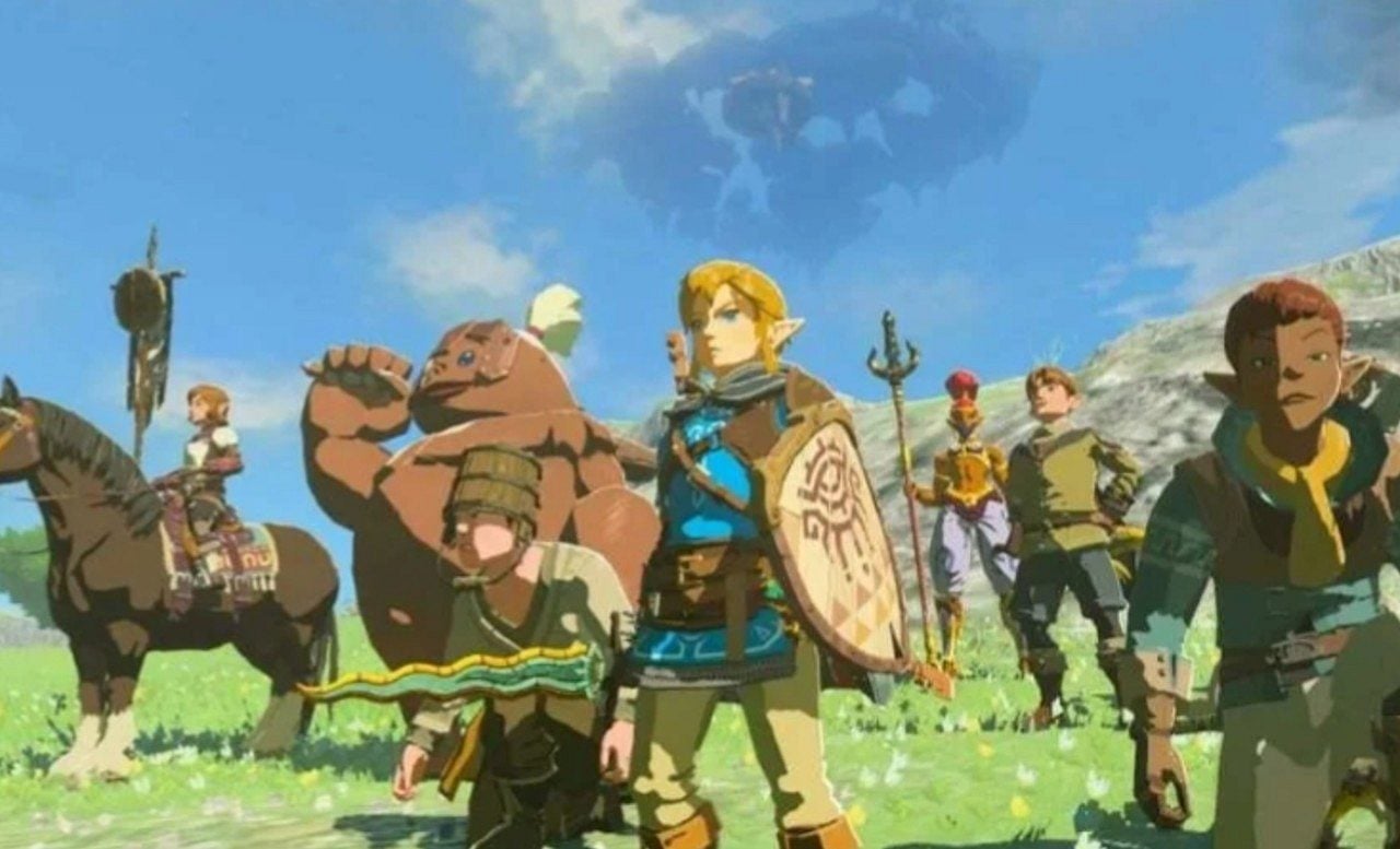
The transition to Breath from the Wild brought another significant change in artistic direction. The game adopted a watercolor-inspired aesthetic, with improved details but maintaining the characteristic stylization. The sprawling open world benefited from textures that conveyed scale and depth without aiming for direct photo-realism. Tears of the Kingdom followed a similar path and expanded the mechanics of building and interacting with the environment.
Mesmo With the original Switch capable of running games with more detailed graphics in other genres, the series opted for visual consistency that did not compete directly with the realism of other platforms. Essa’s deliberate choice helped create recognizable and timeless worlds, preventing games from aging quickly compared to titles that pursue extreme graphical fidelity.
- Cel-shading of Wind Waker allowed for expressive animations and vibrant scenery that has aged well
- The artistic direction of Breath of the Wild and Tears of the Kingdom prioritized immersion and gameplay fluidity
- Tech old demos served to demonstrate hardware, not as a basis for final games
- Mudanças visuals have always accompanied new core mechanics of the franchise
- Estilização prevented games from becoming visually dated quickly
Capacidades from Switch 2 and community speculation
Nintendo Switch 2 brings significant upgrades in processing and support for higher resolutions. Jogadores speculate intensely whether the console allows for greater graphical fidelity without losing the essence that defines the series. A segment of the community advocates a look with more realistic proportions and advanced lighting, inspired by old demos or the style of Twilight Princess, which used darker tones and details closer to realism.
Outro group argues that strong stylization remains ideal for the medieval fantasy that characterizes Zelda. Essa approach maintains the fairy tale tone and makes gameplay elements such as enemies, obstacles and interaction points easier to read. Extreme Realismo may require more computing resources and make the game dated more quickly, from this perspective. Discussões on specialized forums and social networks shows a clear division between these two views on the future look of the franchise.
Histórico of creative decisions and the future
The series changed appearance several times without repeating established formulas. Cada console brought its own identity that fit the specific technological and creative moment. Cel-shading, watercolor, and evolved cel-shaded details proved the franchise’s versatility in different contexts. Nintendo historically reveals visual direction alongside core game mechanics, showing that aesthetic choices serve gameplay first and foremost.
Fãs who desire realism cite the power of Switch 2 for better textures, dynamic lighting, and sophisticated visual effects. Quem prefers stylization highlights that fantastic worlds gain more from artistic abstraction than from an attempt to faithfully copy reality. Ambas visions appear in recent debates about the first great Zelda of the new generation, reflecting the passion that the community maintains for the franchise after 40 years of history.
Nintendo continues to not officially announce Zelda’s next main title for Switch 2. Enquanto that, the community follows rumors, speculative analysis and discussions about which artistic direction the company will choose. Qualquer’s decision must balance technical innovation with the unique identity that has made Zelda one of the most respected franchises in video game history.