Apple system update changes access to alerts to focus on artificial intelligence
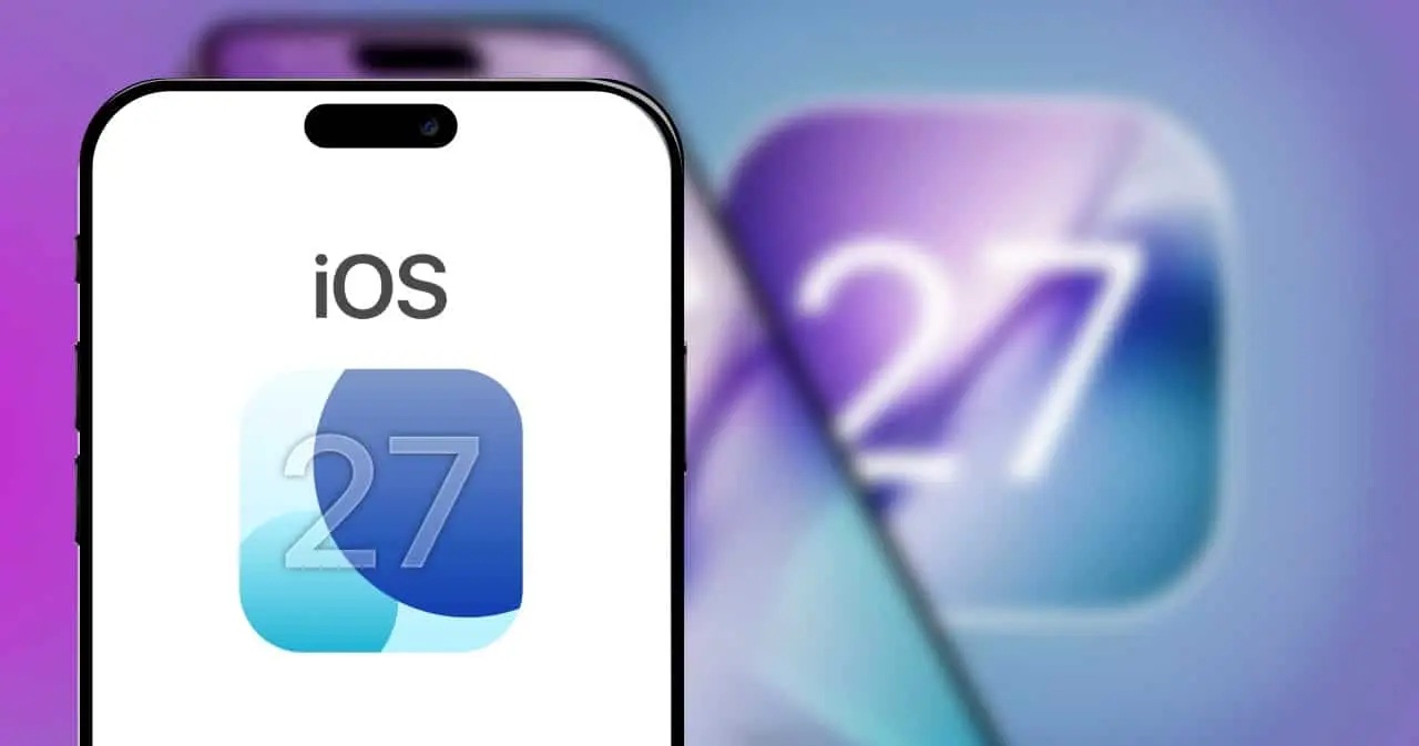
The next major software update for Apple’s mobile devices promises to radically transform the way we interact with screens on a daily basis. With the imminent arrival of iOS 27, owners of thousands of iPhones and iPads will need to adapt to a profound overhaul of the operating system’s basic navigation. The central focus of this structural modification is to give absolute protagonism to artificial intelligence, downgrading the importance of classic resources that have been part of the ecosystem for more than a decade. The main victim of this restructuring is the chronological alerts panel, which will lose its prime activation space to make way for the new generation of the company’s virtual assistant, marking a key turn in the company’s design philosophy.
Since 2011, when the fifth version of the mobile operating system was launched on the global market, consumers have become accustomed to pulling the screen from top to bottom to check messages, emails and missed calls. At that time, the introduction of this unified repository solved the problem of constant screen interruptions. This intuitive movement, rooted in the muscle memory of millions of individuals around the world, will now undergo its first drastic change. When the user configures and enables the device’s new intelligent functions, the traditional swipe from the top center of the display will no longer display the application message history, requiring a new learning curve.
On the same topic: Apple trains its own AI model for the China market in partnership with Alibaba
In place of this list of warnings, dragging your middle finger from the top edge down will immediately invoke the revamped Siri interface. This command substitution clearly demonstrates that the technology giant believes that interacting with generative algorithms will be the most frequent and important activity in its customers’ daily routine. The change reflects a market transition: users are moving from being mere passive recipients of notifications to becoming active operators of productivity tools based on advanced voice and text commands.
How the commands are organized in the new tactile interface
Despite the aggressive change to the default behavior of the home screen, the Cupertino-based company has not eliminated the warning repository, understanding that it still has its basic usefulness. The brand’s software engineering found a workaround to keep the functionality alive, albeit in a noticeably less privileged position. To ensure that the transition occurs in a structured way and avoids constant accidental touches, the gesture mapping was sliced into specific millimeter zones on the top bar.
- Swipe from the top center: exclusively activates the new virtual assistant based on artificial intelligence, occupying the largest contact area.
- Swipe from the top left corner: opens the traditional screen with the history of messages, emails and notifications pending reading.
- Swipe from the top right corner: continues to display quick shortcuts for connectivity, volume, brightness and media control.
The impact of this redistribution of touch zones will be even more noticeable on larger screens, where ergonomics already require wider movements. On iPad line tablets, the vast horizontal expanse located above the grid of icons will be almost entirely dedicated to activating AI. Depending on how the owner configures the clock and calendar widgets on the lock screen or home page, the contact area for pulling up old notices may become extremely narrow. This will require much greater precision from iPadOS 27 users than was required in previous versions of the system, changing the dynamics of use in work and study environments.
More on this story: Uber expands global reach with 2,000 Pony.ai robo-taxis in Europe
See Also

Nintendo launches nine games in May 2026 to unite Switch generations

NASA accelerates Artemis 3 mission with assembly of the Orion spacecraft and new tests
Apple system update crashes cell phones and drains battery quickly
History of breaking paradigms in ecosystem navigation
Changing consolidated habits and forcing customers to adapt is not new to the North American manufacturer’s trajectory. Technology analysts often recall that a similar usability shock occurred during the launch of the iPhone X, a milestone that eliminated the iconic physical home button. On that occasion, the quick shortcuts center, which used to be pulled out from the bottom of the glass, was abruptly moved to the upper right ear of the display. The standardization of this new format took a few months for the general public to assimilate, but it ended up becoming the definitive industry standard, being copied by several competing brands in the following years.
The current bet with iOS 27 follows exactly the same philosophy of courageous and, at times, imposing design. The company understands that, to introduce a revolutionary technology that requires constant and natural use, it is strictly necessary to sacrifice old conveniences. The relocation of the message board to the left side forces a motor re-education that breaks a fifteen-year cycle of automatic repetition. This strategic move highlights that the era of smartphones focused primarily on displaying notifications and alerts from social networks is definitely in the past, paving the way for the era of proactive assistance.
Initial reception of the virtual assistant justifies the user’s effort
The big question that hangs over this massive update is whether the inconvenience generated by the breakdown of muscle memory will be adequately compensated by the practical usefulness of the replacement tool. Technology experts and developers who have already had contact with preliminary versions of the software report that Apple’s cognitive engine presents an impressive leap in quality compared to previous generations. The new natural language processing architecture allows for much more fluid dialogues and complex problem resolutions in seconds.
Learn more: Google launches Gemini 3.7 Flash with coding improvements and promotional price for developers
Furthermore, the ability to understand continuous context, improved response speed and deep integration with the device’s local data mean that the new Siri truly deserves the prime screen real estate. By turning what could be just an initial ergonomic frustration into a necessary advancement for the future of mobile computing, Apple is signaling that sacrificing the old Notification Center gesture is a small price to pay for a genuinely smart device capable of anticipating the needs of the modern user.