Apple’s next major operating system update promises to significantly refine users’ visual experience. Recent Rumores point out that the company will implement a long-awaited tool to manage the design introduced the previous year. The main new feature involves fine-tuning the graphical interface. The core feature will be a slider dedicated to managing the Liquid Glass effect across the entire mobile platform.
The feature will allow iPhone owners to calibrate the intensity of transparency and contrast globally. Especialistas from the technology sector, including journalist Mark Gurman from Bloomberg, indicate that the change seeks to resolve frequent complaints about text readability. The novelty should be the software’s greatest usability highlight. The movement demonstrates a growing concern with adapting the system to the individual needs of each consumer.
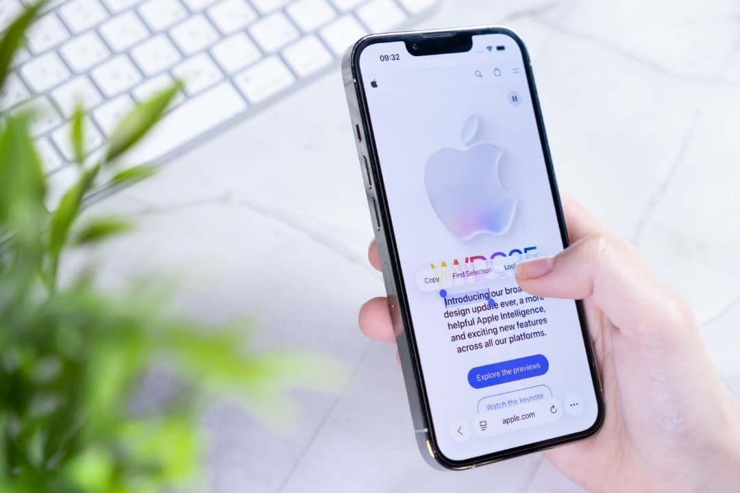
Expansão of opacity control in the interface
Atualmente, users have extremely limited options to customize the translucent appearance of the system. The settings menu only offers two stark alternatives for the screen design. The Claro style keeps transparency at its maximum level, revealing the wallpaper beneath the icons and panels. Já or Colorido format applies a denser opacity layer. Essa second option refers to the visual standard adopted in previous generations of the software.
The introduction of a sliding mechanism will transform this dynamic in a profound and definitive way. Instead of choosing between two pre-defined extremes, the individual will have the freedom to find the exact point of visual balance. The adjustment bar will work very similar to controlling screen brightness. Isso means that the transition between fully translucent and completely opaque will occur smoothly and seamlessly.
Essa structural change directly affects the way the system renders layers of information. Graphics processing will need to calculate the virtual light passing through interface elements in real time. Adaptation requires considerable software engineering effort to ensure that the device’s battery does not drain quickly. Code optimization is fundamental to the success of the endeavor.
Desafios technicians surpassed by the development team
The intention of offering this freedom of customization is not exactly new within the company’s laboratories. Engenheiros attempted to ship the full slider during the development cycle of the previous version of the operating system. Naquela occasion, architectural barriers prevented the universal application of the tool. The processing required to render variable transparencies was hardware resource intensive.
Como As a result of these initial limitations, the functionality reached consumers in an extremely restricted way. The software team managed to enable fine-tuning only for the clock displayed on the lock screen. Crucial navigation Elementos remained fixed to factory defaults. Agora, with deep optimizations in the source code, the technical barrier seems to have finally been overcome by the developers.
- Pastas applications will respond to the new configured opacity level.
- The home screen will reflect contrast changes immediately after adjustment.
- Lower navigation Barras will gain customized visual behavior.
- Floating Notificações may have a darkened background to facilitate reading.
- Full transparency will continue to be available as the device’s factory default.
The universal application of the resource required a rewrite of fundamental components of the graphical interface. Cada widget and icon needed to be adapted to interpret the new slider commands without failing. Visual standardization ensures that native and third-party applications speak the same aesthetic language.
Impacto directly in the daily usability of devices
The design based on layers of glass brought an undeniably modern look to the devices, inspired directly by visionOS. However, the bold aesthetic generated unwanted side effects for a considerable portion of the consumer public. Overlaying translucent elements often makes smaller texts or thin fonts less readable. Very colorful Fundos makes navigation confusing when transparency is at maximum.
Returning control to the user resolves this friction without compromising the visual identity established by the brand. Pessoas with vision difficulties will be able to increase contrast without having to resort to deep accessibility menus. At the same time, translucent design enthusiasts will keep the original experience intact. Flexibility becomes the keyword in this iteration of the software.
Além from glass tuning, the update will bring specific fixes for erratic interface behavior. Relatos over Música application MiniPlayer shrinking for no apparent reason gained priority attention from developers. Falhas scrollbar visuals are also on the extensive list of scheduled fixes. The focus falls heavily on the overall stability of the platform.
Histórico of visual refinements in the brand’s systems
The strategy of launching a radical change and refining it in the following years is a trademark of the manufacturer. The ecosystem went through an identical process after transitioning to flat design more than a decade ago. Naquela time, the removal of realistic textures caused initial strangeness and required multiple corrective updates. The maturation of the look occurred gradually and steadily.
The Liquid Glass concept follows exactly the same corporate evolution guide as the company. The first version laid the aesthetic foundation with its layers of depth and dynamic blur. Agora, the second phase focuses on polishing the edges and delivering advanced management tools. The company demonstrates that it listens to feedback from the developer community.
Pequenos tweaks had already been tested in smaller updates over the last twelve months. The introduction of the basic style selector was the first step in this long journey of visual adaptation. The arrival of the slider represents the completion of this maturation cycle of transparent design.
Expectativas for the official announcement at the conference
The technology giant’s traditional calendar points to a well-defined schedule of annual launches. The WWDC 2026 conference, scheduled for June 8th, will serve as the stage for revealing all the news. Durante the event, executives will demonstrate the practical operation of the new interface control on the main stage. The global technology community follows the date with great anticipation.
Imediatamente after the main presentation, programmers enrolled in the company’s program will receive the first test version. Essa beta phase is crucial to identify rendering flaws before mass distribution. The general public will only have access to the finalized system in September. The launch will coincide with the arrival of the new generation of smartphones on the international market.
The information leaked so far indicates an update focused on digital quality of life. The absence of drastic revolutions in layout suggests a period of consolidation for the brand’s mobile platform. Enhanced translucent glass technology reinforces the commitment to sophisticated aesthetics. iOS 27 is on track to be one of the most stable and customizable versions ever developed for the iPhone.