

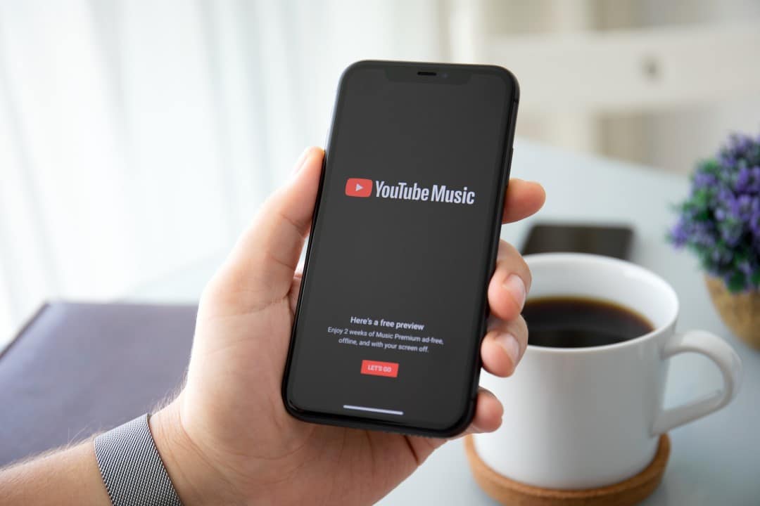
Google has started rolling out a significant update to the Music YouTube interface, modifying the layout of the navigation elements in the application. The main change consists of transferring the search icon, which was previously at the top of the screen, to the bottom menu bar. The audio streaming platform implements this design overhaul with the aim of facilitating quick access to search features. Usuários from different regions are already starting to notice the new visual organization on their mobile devices.
Structural adjustment reflects a consolidated trend in the development of modern applications, which seek to adapt the main controls to the natural reach of the thumb. The change replaces the old exploration tab in the bottom menu, requiring an adaptation in the muscle memory of service subscribers. Especialistas in usability point out that the change optimizes the experience on smartphones with large screens, a dominant standard in the technology market in 2026. The company carried out preliminary tests with a restricted group before releasing the final version.
Mudança in the interface prioritizes one-handed navigation
The new Music YouTube bottom bar configuration now displays four main options for the user. The home, samples, and library buttons remain in their original positions, ensuring continued basic use. The space previously occupied by the discoveries section now houses the research magnifying glass. When tapping this new shortcut, the application immediately activates the operating system’s virtual keyboard. The feature speeds up the typing process. Reducing the time needed to find specific tracks or artists improves usage dynamics.
The top panel of the interface also underwent a visual simplification process after removing the search bar. The area now has a cleaner layout, displaying only the user’s profile photo, the notifications icon and the shortcut for transmitting content to external screens. Reducing visual elements at the top of the application reduces graphic clutter and focuses the listener’s attention on the musical content. The minimalist interface follows the latest design guidelines adopted by Google in its software ecosystem.
Advanced search features remain integrated into the new bottom menu, with no loss of features for subscribers. The voice recognition system remains available, allowing the search for audio commands. The tool that identifies songs through whistling or humming was also maintained in the new search screen. The user finds these options right next to the typing bar. The versatility that characterizes the technology giant’s streaming service remains intact.
Reorganização of the menus and new location of the discoveries tab
Removing the direct shortcut to the explore section required a strategic repositioning of this content within the application. The newly designed search screen now acts as a central hub for discovering new music and trends. The top of this page displays the user’s recent search history, making it easy to return to previous queries. Logo below this record, the platform presents the complete exploration grid that previously had an exclusive tab.
The grouping of functions on a single screen aims to optimize the navigation flow without removing options from the catalog. The discovery grid continues to offer direct access to the service’s main content pillars. The listener can browse different categories organized into distinct visual blocks. The framework maintains clear separation between media types and algorithmic suggestions.
- Recent Lançamentos bring together the latest news from the global music industry.
- Successful Paradas shows the most played tracks in different countries.
- Filtros mood and music genre help in creating personalized soundtracks.
- Seção dedicated to podcasts integrates spoken audio programs into the musical environment.
The integration of podcasts on this same screen reinforces Google’s strategy of unifying different audio formats in a single application. Transitioning listeners from the former Google Podcasts to the YouTube Music requires an interface capable of accommodating a wider variety of content. The new search page meets this demand by centralizing active search and passive discovery in the same environment. The design avoids creating excessive menus that could confuse new users of the platform.
Application Atualização requires recent versions on operating systems
The implementation of the new layout occurs gradually through updates to the most popular mobile operating systems on the market. Google has established version-specific requirements to ensure proper functioning of the redesigned interface. Proprietários and Apple devices need to have the app updated to version 9.22 on iOS. Usuários of the Android system must check if they have version 9.21 or higher installed on their devices.
The mass update distribution process often introduces variations in arrival time for different accounts. Alguns users may not see the new bottom bar immediately, even if they have the correct software version. The technical support team suggests a simple procedure to force the interface to update in these cases. The method consists of accessing the operating system settings and forcing the application to stop.
Forcefully terminating the process clears the current state of the software and forces the application to fetch the latest settings from the company’s servers during the next startup. Restarting typically applies pending design changes instantly. Caso the procedure has no effect, the user must wait for the interface to be automatically released for their specific account. The Google update schedule envisions full user base coverage over the next few weeks.
Estratégia’s Google aims to increase competitiveness in the streaming market
The global audio streaming market presents a highly competitive scenario in 2026, requiring constant innovations from companies in the sector. YouTube Music competes for consumer preference with established giants, requiring practical differences to attract and retain subscribers. Continuously improving usability represents a crucial factor in users’ decisions when choosing their primary music platform. The fluidity of the interface directly impacts the time spent in the application and the volume of media consumption.
The relocation of the search bar demonstrates an in-depth analysis of listeners’ behavior patterns during everyday use. Searching for specific tracks is one of the most frequent actions in audio applications, often surpassing passive browsing through playlists. Reducing the physical effort required to reach the search tool translates into a more pleasant and efficient user experience. The company invests significant resources in interface testing to inform these design decisions.
YouTube Music’s development history reveals a pattern of progressive refinement since its original release. The platform absorbed the functionalities of the old Google Play Música and, more recently, of the company’s podcast service. Consolidating so many resources into a single mobile environment presents a complex information architecture challenge. The new bottom bar simplifies this structure, setting the stage for future tool additions without compromising visual clarity.
Impacto of big screens in mobile software development
The design of mobile applications is undergoing a transformation dictated by the physical evolution of cell phones. The constant increase in the average size of smartphone screens has made interacting with elements located at the top of the display an ergonomic challenge. The need to use both hands or readjust your grip on the device to tap a higher icon creates friction in the user experience. The technology industry responds to this reality by moving primary actions to the bottom half of the screen.
YouTube’s Music update aligns the app with this ergonomic design philosophy, known as the thumb zone. The bottom area of the screen represents the most comfortable reach for most users who hold the device with just one hand. The change especially benefits people who use the application on the move, while walking or on public transport. Ease of access to search encourages more frequent interaction with the platform’s vast music catalog.
The refinement of the graphical interface reflects the maturity of the product in the digital services ecosystem. Attention to ergonomic details demonstrates the development team’s commitment to the final quality of the software delivered to the consumer. The search bar transition ends a testing cycle and launches a new navigation standard for millions of daily listeners. The application’s continuous evolution ensures its relevance in a technological market characterized by rapid changes and high user expectations.