

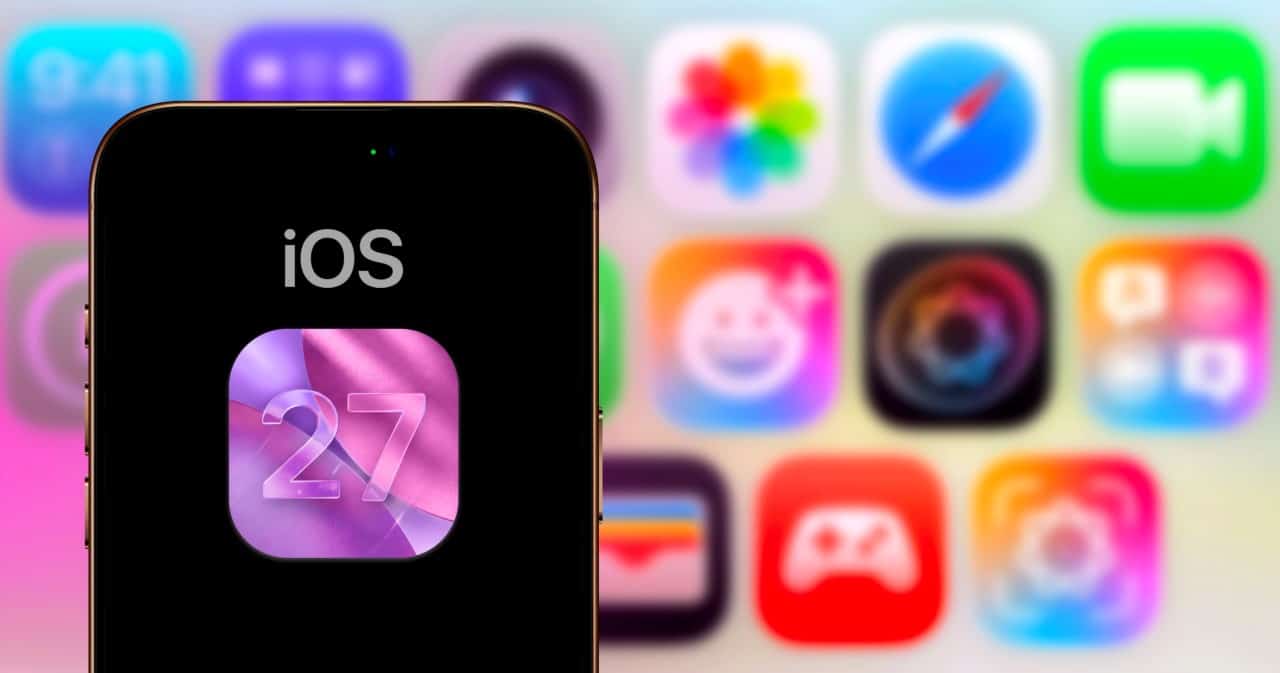
The Cupertino giant decided to take a step back and return visual control to the owners of its devices with the arrival of iOS 27, iPadOS 27 and macOS 27. After months of intense debates in technology forums about the usability of its interfaces, the company implemented an unprecedented slider for the so-called Liquid Glass. This translucent finish, which simulates frosted glass and depth on screens, can now have its intensity calibrated down to the millimeter by the individual. The tool is already active for those who have access to test builds aimed at developers.
This change in stance reflects the brand’s adaptation to modern demands for digital ergonomics and visual comfort. The aesthetic concept, heavily inspired by the spatial language of recent mixed reality devices, requires a lot of graphics processing and does not always adapt perfectly to all lighting environments. By allowing opacity to be managed manually, the manufacturer tries to balance the sophistication of its design with the practicality necessary for daily use.
User interface experts point out that granular customization is an irreversible trend in the mobile device market. Instead of imposing a single standard, big technology companies are realizing that personalization is the key to retaining demanding consumers. The new scrollbar is strategically hidden in the internal menus, but promises to transform the way we see notifications and control panels.
The evolution of translucent design and the challenges of reading on Apple screens
When the previous generation of software arrived on smartphones and tablets last year, public reception was quite divided. While design enthusiasts praised the modernity of the wet glass effect, a significant portion of customers reported rapid eye fatigue. The main obstacle occurred when dark texts overlapped with vibrant or highly detailed wallpapers, creating visual clutter that made it difficult to quickly read messages and alerts.
In an attempt to put out this initial fire, the software engineering team released a corrective package months later, bringing two fixed display options. The preset modes offered only the extremes: a completely crystal clear version or a tinted and heavy variant that took away almost all the fun of the original interface. Organizations focused on digital accessibility criticized the binary approach, arguing that people with astigmatism or light sensitivity needed an exact middle ground to use phones without discomfort.
How the new opacity mechanism works in recent operating systems
Listening to constant complaints from the community, the massive update scheduled for 2027 brings the definitive solution through a dynamic selector. The great advantage of this tool is the ability to render changes instantly on the screen, without the need to restart the device or close applications. As the finger slides across the meter, the screen background reacts in real time, allowing the cell phone owner to find the exact point of comfort for their eyes.
The adjustment mechanics were designed to be intuitive even for those unfamiliar with advanced settings. Dragging the virtual button to the left maximizes the light passing through, leaving the menus almost invisible, while moving it to the right solidifies the colors and blocks the background. For those who regret the modifications, simply return the marker to the center position, immediately restoring the factory default designed by the original designers.
Step by step to modify the graphical interface on iPhone and iPad
Access to this new feature has been simplified to ensure that anyone can adapt their display in a few seconds. Currently restricted to programmers registered in the testing program, the functionality should soon reach the general public through the open beta version. Those who are already running preliminary editions of the mobile system can try out the customization by following a very direct path in the internal menus.
- Unlock your device and tap the gear icon to open the main settings panel.
- Navigate through the list of categories until you find the menu dedicated to system display and appearance.
- Tap the specific tab named with the translucent glass effect to open the new options.
- Move the horizontal marker left or right until the texts are comfortable to read.
Hardware requirements and the way to change the look on Mac computers
Apple’s ecosystem of desktop computers and notebooks also received the same visual personalization technology. However, there is an important technological barrier: fluidly rendering this blur in real time requires modern graphics processors. Because of this, the manufacturer confirmed that only machines equipped with the Apple Silicon family of chips will support the feature, leaving old models based on Intel architecture out of this aesthetic novelty.
- Click on the apple logo in the top left corner and open the machine’s general settings.
- Search for the appearance section in the left sidebar of the control panel.
- Scroll down the page until you find the translucent effect customization block.
- Use your mouse or trackpad to set the ideal opacity level for your monitor.
Accessibility alternatives and expected launch with new hardware
Even with the introduction of this highly accurate scroll bar, some severe visual conditions may require more drastic contrast measures. With this in mind, the company kept the classic accessibility tools intact in its deep menus. Established functions that completely remove any trace of transparency or force dark outlines around buttons remain available to ensure the technology is truly inclusive for all audience profiles.
The official schedule indicates that the final and stable version of all this software will reach consumers during the autumn season in the northern hemisphere. The financial market and technology analysts are betting that the download will be released in the first half of September. This date traditionally coincides with the global unveiling event of the long-awaited iPhone 18 line, creating a renewed ecosystem in both the physical and digital experience of users.