

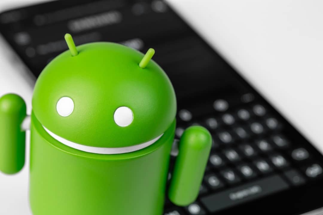
The search giant has prepared a profound overhaul of the way people express themselves digitally. Google’s operating system now adopts a fully three-dimensional graphics package for its famous faces, configuring the most significant aesthetic change ever made to this catalog. This new feature promises to change the dynamics of messaging and the visual interface on a global scale, reaching billions of cell phones and tablets.
Graphic depth and the new visual identity of the figures
The design work added layers of volume to the classic icons everyone already knows. Now, each element features smoothed edges, dynamic shading and a perspective that creates the illusion of a physical object on the screen, definitively moving away from the era of old “drop” shaped emojis (the famous blobs) that marked the system years ago. While the brand essence remains intact, readability has been improved for any display aspect ratio, resulting in clear modifications to faces, everyday items and signage.
Usability specialists were called in by the company to ensure that each figure was identified in fractions of a second. Assessments carried out in the company’s laboratories proved that the updated aesthetics reduce the chances of double interpretation. If in the past some illustrations caused communication noise when sent to other operating systems, the recent standardization seeks to deliver a unified message, also counting on a fine adjustment in the color palette to optimize contrast in both light and night themes.
How will the distribution of the new feature on devices work?
The graphics package arrives directly through the software core, which ensures automatic replacement of the device’s entire original collection. Popular chat platforms, such as WhatsApp and Telegram, which use the graphic resources of the cell phone itself, will display new faces instantly. On the other hand, software that runs with an independent image bank will not undergo changes, as the redesign focuses exclusively on the device’s standard keyboard.
Learn more: Japanese operators fix Wi-Fi failure in the new Galaxy Z Fold8 and Flip8
Cell phones running previous editions of the software will not be left out, as an update to the WebView component will guarantee the necessary support. Devices operating from Android 8.0 will be able to load three-dimensional graphics without any restrictions. The developer chose not to set a specific day for the global launch, preferring to adopt a staggered release over the next few months, which means that certain consumer profiles will see the renewed interface weeks before the rest of the public.
Division of the catalog and the numbers of the aesthetic reformulation
The modernization project encompasses a total of 3,633 illustrations, distributed among the following fundamental sections:
- Faces and feelings: 180 options that encompass skin diversity and new emotional reactions
- Fauna and flora: 585 figures that depict everything from wildlife to botanical elements
- Gastronomy: 350 icons focused on dishes and ingredients consumed worldwide
- Sports and leisure practices: 225 representations of pastimes and Olympic disciplines
- Tools and signs: 1,200 items focused on mathematics, technology and decoration
- Tourism and geography: 510 images highlighting monuments and means of transport
All divisions follow a unified design logic to maintain interface harmony. The yellow faces preserve the striking and fun features that are the brand’s signature, while the inanimate items have received a texture treatment that provides a balanced level of realism. The color spectrum has also been expanded to 240 fundamental tones, ensuring that elements of nature are portrayed with extreme visual fidelity.
Practical benefits of the new interface in daily communication
The three-dimensional look delivers considerable improvements for those who use quick chats, online forums and virtual work environments. The figures now stand out in the alert bars and take center stage in very extensive chat histories. People who have some degree of visual impairment also benefit greatly, as the reinforced contours and high contrast make it easier to quickly read the symbols.
Dialogue between people from different countries gains fluidity with the elimination of cultural barriers in the interpretation of drawings. In the past, the same icon could mean opposite things in the West and East, a problem that the current standard tries to solve through a more neutral aesthetic. In the corporate environment, workers will have a more sober-looking catalog at their disposal, moving away from the children’s cartoon aspect that predominated in previous versions.
On the same topic: Apple details reason for excessive battery consumption on iPhone after installing new iOS
Adjustments and features aimed at the next generation of the system
The future edition of Android 15 will launch a menu dedicated exclusively to graphical control of these illustrations. Smartphone owners will have the freedom to turn on a basic display mode, ideal for saving battery power on more outdated hardware. Furthermore, a transition tool will give the option to revert the graphics to the old format for a set period of time, helping the audience adapt.
Application creators are receiving new programming keys to embed their own figures without breaking the visual harmony of the cell phone. The entire instruction manual is now available on the official portal aimed at programmers. Browser-based services also benefit, as they will be able to pull files directly from Google Fonts, creating a perfect aesthetic bridge between the experience on the computer and on the smartphone screen.
Release and arrival deadlines for cell phone manufacturers
Alerts about package availability will start popping up on screens between the months of August and September. To avoid connection drops, the technology giant has organized a virtual queue that will deliver files in a cadence. The experimentation phase took place in June, involving half a million subscribers to the company’s testing program, whose opinions were crucial in redrawing the lines of 127 illustrations before the official launch.
More on this story: Google introduces Pixel 11 series with improved Tensor G6 chip and new Pixel Tag
Partner brands, including Samsung, Xiaomi and OnePlus, already have the definitive codes in hand to include the new feature in monthly correction packages. Displaying three-dimensional graphics does not require a cutting-edge processor, as the changes take place in intelligently compressed text files. The extra weight generated by these images is no more than 15 megabytes, a volume that goes completely unnoticed in the storage memories of current phones.